
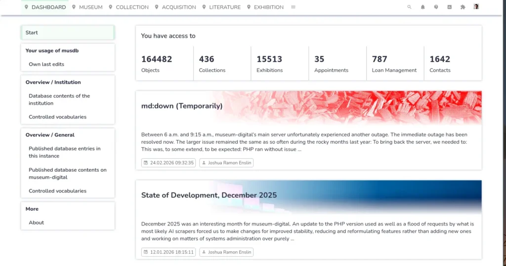
musdb is almost as old as museum-digital itself. From its beginning sometime around 2009 or 2010, it has significantly grown in size and scope. Originally, it was created as an input interface for the publication of museum objects. Today, it aims to be a full fledged collection and museum management solution, capable of covering publishable object and exhibition data, internal aspects of collection management such as climate sensor readings and loan management as well as providing general knowledge and project management capabilities.
Over all that time however, the basic architecture of musdb remained basically unchanged, with new functionality fit in or added on top where it seemed suitable. Additionally we have been struggling with the duplicate implementation of several functionalities at different times, where one implementation offers a very simple access to the respective data (e.g. a free text field), while the other offers a representation of the same data in a much more fine-grained, precise, and more interlinked way, whose requirements are however harder to fulfill during imports and that requires a more thorough documentation generally.
We routinely get very positive feedback from colleagues working in museums, that musdb is comparatively easy to use and logical. The age of the architecture as well as the many small inconsistencies in terms of the user interface that have crept in over time however suggest that it is time for a more radical reimagining of what musdb looks and works like.
This post is a first small preview to what musdb should look like starting in the third quarter of 2026. After a more thorough discussion of the reasons for rewriting significant parts of the publications, some first glimpses into the new version are provided at the end of this post.
Reasons
Technical
musdb is primarily a PHP application. As such, the internal logic as well as most of the user interface rest on the server. Almost all of the user interface is rendered into HTML on the server and then sent to the browser to generate what a user can view. Some functionalities that require additional interactivity, are presented in overlays, etc. are implemented in JavaScript and processed directly in the browser, with the JavaScript drawing its data both from the HTML as well as APIs (some internal, some documented for internal and external use).
Speaking in modern web development terms, PHP covers model, view, and controller on the server, with JavaScript extending the view somewhere half-way. Logically, this is problematic. In brutal practicality, it means that musdb’s JavaScript components are a collection of small scripts always dependent of some external (PHP/server-side) preparation and not logically interacting with each other. This prevents lots of the benefits of a more structured programming from being used altogether.
Our aim with the technical architecture of a reimagined musdb is to design musdb as a modern single page application with all data being provided by clearly documented APIs. This will come with several benefits:
- The view layer is entirely processed entirely in the client, providing a clear logical division between the different tasks
- With a modern build infrastructure, code can be reused much more than thus far, providing a better maintainability in the long run
- musdb will come with barely any browser-level page reloads. If an API is queried, the application can clearly communicate what is being loaded and for what purpose.
- As musdb’s UI will be entirely built based on the same API as can be used by external developers, that API will be fully feature-complete by the end of the process.
User interface
The general structure of musdb’s user interface has proven itself to be quite good. However, as musdb has grown over the years, a lot of small inconsistencies and opportunities for improvement have crept in.
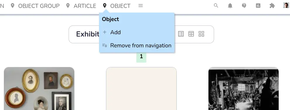
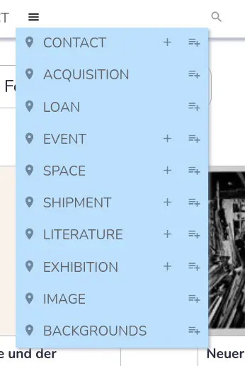
Take the navigation alone:
- To access object groups, one can always hover over the three dots sub-menu of the navigation section on the very top right. If one enables the menu option “object group” in the personal settings (accessible by clicking on one’s name), one can also quickly access it via the quick access navigation (the second line of the navigation). As such, simply accessing a central part of musdb is spread over three different sections of the navigation.
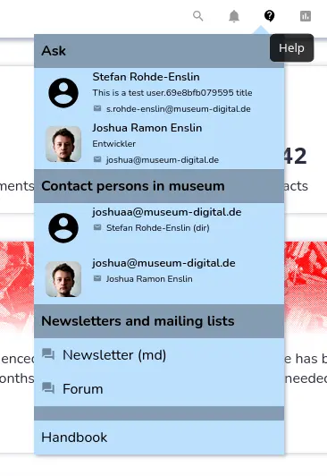
- There are two question mark icons in the navigation. One, in a speech bubble, links to communication channels and contact persons that one can use to seek help. The other provides links to the handbook. On the one hand, there is a clear logical differentiation between the two. On the other, both look similar and follow rather similar aims. That the two sub-menus are divided rather than being merged into a single sub-menu is not intuitively apparent.
- Clicking on the page title or the colored circle at the right of the navigation opens the context-independent search function. Both bear no resemblance to an icon associated with searching and actually follow entirely different primary aims by themselves.
Many similar issues exist around musdb. In most cases, these somehow make sense and are logical in themselves – but they still contradict a seamless, intuitive use of the application.
Additionally, there are some functionalities that in themselves contradict a more streamlined use of musdb. One such example also accessible via the navigation is the option for users to set their preferred page to be referred to right after they log in. musdb has been built more and more on the premise, that users will start their use of the application on the dashboard, and thus some features – like requiring users to enable two-factor authentication for regional administrators – can be bypassed by selecting any non-dashboard start page. The option to select a non-standard start page will hence almost certainly be scrapped in the new version of musdb.
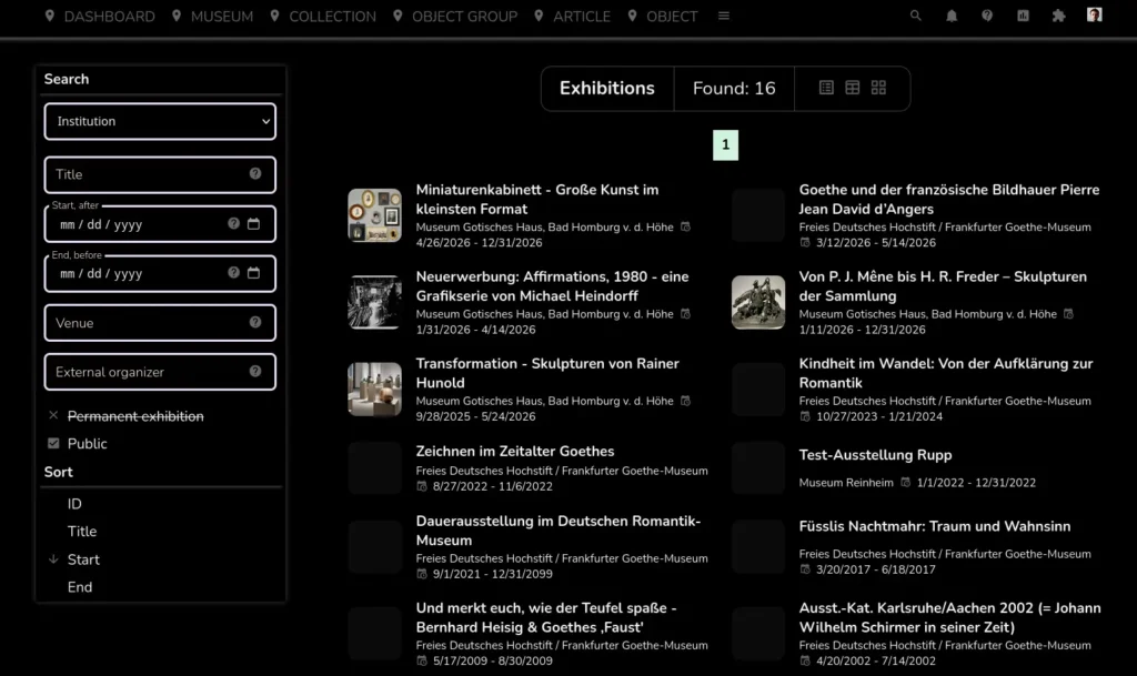
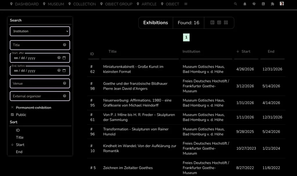
Preview
For now, only the basic scaffolding, most of the navigation and some of the overview pages have been implemented in the new version. Screenshots of these can be seen below. Importantly and yet missing, each different section of musdb is planned to come with an icon representing it in the navigation (top left).
Note also, that nothing about the new UI is set in stone. These are first drafts. More will follow soon.
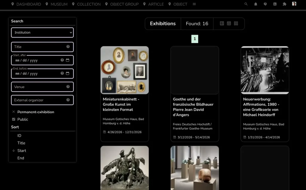
It is also the first in this list of screenshots to display the new musdb UI in dark mode.