

A general benefit of using computer systems is – or should be – that data once recorded can be retrieved and reused in different contexts than originally intended and retrieval and reuse are incredibly easy to do when compared to the physical realm. And thus comes the want for ever more pervasive and broad evaluation – it has always been useful, but using computers it is possible as well. Where finding out the average length of all objects in one’s collection would have been a work of months before and was very error-prone – checking the index card for each object in the collection, noting down the length in a new list, and summing them up – it is now done with a single database query or formula in a spreadsheet program.
Now, what about musdb? For deeper analysis of aggregate collection data – take for example the issue of average lengths above – the best way thus far were exports. The simplest way in this regard was surely the “list results” functionality in the sidebar of object searches, which provides an Excel export of selected fields for all objects filtered through an object search. The data thus exported could then be further investigated and turned into charts using Excel or a similar spreadsheet program.
While this is a rather powerful way for analyzing one’s data in aggregate and does not require the ability to code, it is still cumbersome and involves too many steps to be regularly used (unless one has an immediate occasion like an upcoming report). More immediate ways for analyzing search results for objects (or one’s whole collection) were otherwise limited in scope, like the map view for search results, which displays all events linked to the selected objects.
Starting with a minor update this weekend, musdb now supports a more straight-forward but generally applicable way for evaluating search results or whole collections.
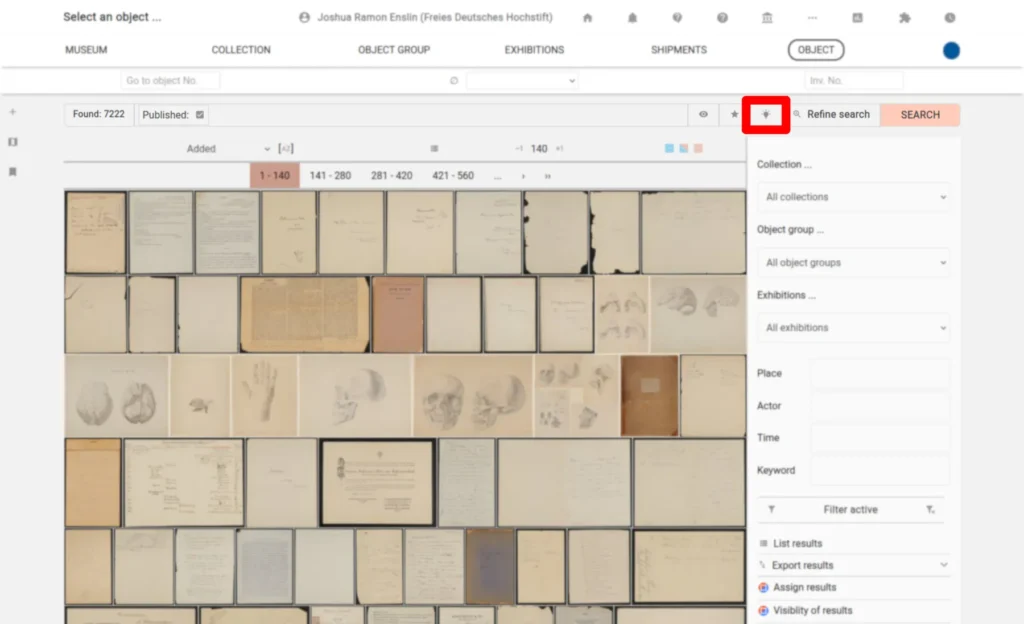
The entry point to this new tool comes in the form of a small button – identified by the light bulb icon – in the search options bar on object search pages.
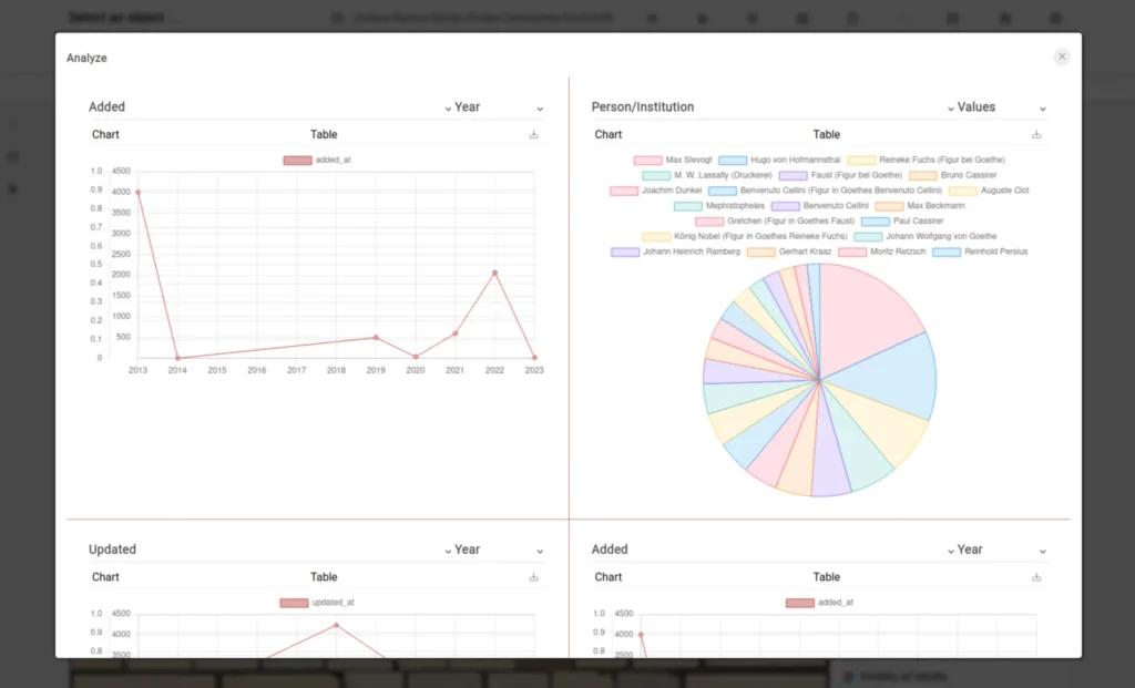
A click on the icon opens an overlay featuring four tiles. Each tile can be set to provide a chart or a table of the values found in a given field for all objects selected by the search query.
Which field’s contents are evaluated, and the way the data is grouped (grouped by year and year and month in the case of date fields; or totals and averages in the case of numeric fields) can be adjusted by clicking on the two select fields making up each tile’s headline. Changes to this selection are stored in the browser to allow for an easy comparison for the results of different searches.
Below the headline of each tile, one can find a navigation offering two options for displaying the information and a download button:
- Chart: This is the default view. It provides a visualization of the data using line charts for numeric fields or date fields grouped by year and pie charts for text fields. To not clutter the interface and improve performance, pie charts are limited to displaying the 20 most used values.
- Table: This option provides a list of the values encountered in the selected field, sorted by their popularity. Each value is clickable, allowing one to further narrow down the search results (thus, we almost accidentally implemented a faceted search feature). Like the pie charts, the table view is limited to displaying the 50 most used values for performance and a simpler user interface.
- Download: Using the download button, one can download the same data displayed in the table view – but without any limit on the number of results – in a CSV file. This file can then be opened using a spreadsheet application to do a deeper analysis or build other types of charts.
As always, we are very curious about user feedback and suggestions for further evaluation functionalities that can be integrated into the overlay.
Image credits: “Exacta-Continental 6000“. CC BY-NC-SA @ Heinz Nixdorf MuseumsForum & Jan Braun