In CSS, one can use different units to determine sizes. The most relevant are:
- A pixel (px) is – in theory – fixed to the single dot of a screen. It thus depends on the resolution of the screen primarily, at least in grey theory.
- A point (pt) is a single point on a printed sheet of paper. Its roots lie in the DPI setting of the print job.
emare relative to the font size. If nested elements come with font sizes determined in em, the scaling is appropriate nested (a headline in a generally enlarged section will be further enlarged than a headline in a regular section).remis relative to the primary font size of the document.vhandvware relative to the total screen height and width respectively. 10vw are, e.g., 10 percent of the total width of the screen.- Some others, like cm or mm exist, but are less used – especially when working outside of print contexts.
Being relative to the font size and nest-able, em values are a great fit for setting sizes of page elements and we thus use almost exclusively use em and rem values for borders, font size, etc.
To make a website responsive, CSS offers a functionality called media queries, with which one can check for characteristics of the browser window. This, obviously, concerns primarily the size of the window, but can also extend to issues such as the activation of a dark mode (if you see this page with white text on a black background, that is the consequence of a media query).
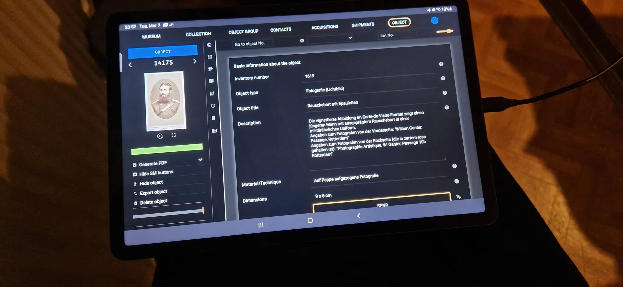
Now, we had also been using em values for probing screen properties using media queries, and the results were far from ideal. Especially phones from different manufacturers provide very different em values even at roughly similarly sized screens. Thus, it becomes hard to determine, if a user really is using a phone, a tablet, or a full sized PC.
Ironically, it is exactly pixel values, that work much more reliably. In theory, a media query asking if a screen is less than 768 pixel wide should definitely be answered negatively in the case of a current flagship phone with roughly 1400 pixel width. In reality, browsers scale down the page and will answer positively, accepting that phones should be presented to CSS as less than 768px wide.
We have now switched to using pixel values for running the media queries to determine the target page layout. And the results are much better, than when we used em values.
See also
W3C: Web Style Sheets – CSS Tips & Tricks: em, px, pt, cm, in…


