Over the holidays we worked on a re-design of the frontend of museum-digital. The reasons were manyfold. While the old design of the frontend still looked well, discussing it with different people – especially those who were not regular users – revealed some shortcomings. Others had naturally developed after five years of use or been inherent in the basic concept of the old page design.
This blog post will first deal with the issues of the old design. A summary of the aims of the new design follows as they were often formulated as a direct response to the shortcomings of the then present. Finally, a tour of screenshots through the new design concludes the post.
The new page design will be published on the night from Tuesday to Wednesday.
For those seeking only a quick overview there also is a small playlist on Youtube.
Problems of the Old Design
Inconsistency
A natural problem of the old design was its growing inconsitency. Quite a number of features and even some sections of the frontend were developed after the last re-design (early to mid 2017). As new features were added, they often did not reuse existing styles and instead used slightly different reimplementations of the same.
Hidden Features or “To View or to Act?”
The likely most consequential issue of the old design lies at its very foundation. In 2017 we had done the redesign aiming to create a design that was very much focused on presenting museum objects in a clear and attractive way.
To underscore the issue of clarity, as well as for their then increasing popularity and the posibility to implement one simply even for users of the Internet Explorer (see below), we chose to go with a stream design. Some sidebars existed for presenting additional information, but the aim was to always clearly focus only one thing. While the design gave quite some space to gaps between different sections to improve focus, it ironically reduced our freedom to label buttons (as can be most evidently seen in the settings bar for searching objects).
In summary: Many features were – at times intentionally – hidden. And thus users did not find them or even learn that they existed.
Internet Explorer
This is not necessarily an issue by itself, but a self-limitation that has now become unnecessary. Was our aim to keep the page at least somewhat usable using Internet Explorer 10. Microsoft’s Internet Explorer did, until its demise, not support many of the newer web standards and trying to keep the page simple to maintain while usable in the browser meant that we could only use older styling options (e.g. CSS grids were not supported).
Lines
Especially during the re-design we noticed that the old design had overused lines. Lines to differenciate different sections, lines to form tiles, lines around buttons. While it had not necessarily occured to anybody I personally have talked to (or they did not say so), a comparison with the new design reveals that the number dividers and separating lines effectively lead to cluttered user interface.
Basic Principles of the New Design
Users Want to See, Read – and Then Do Something About It!
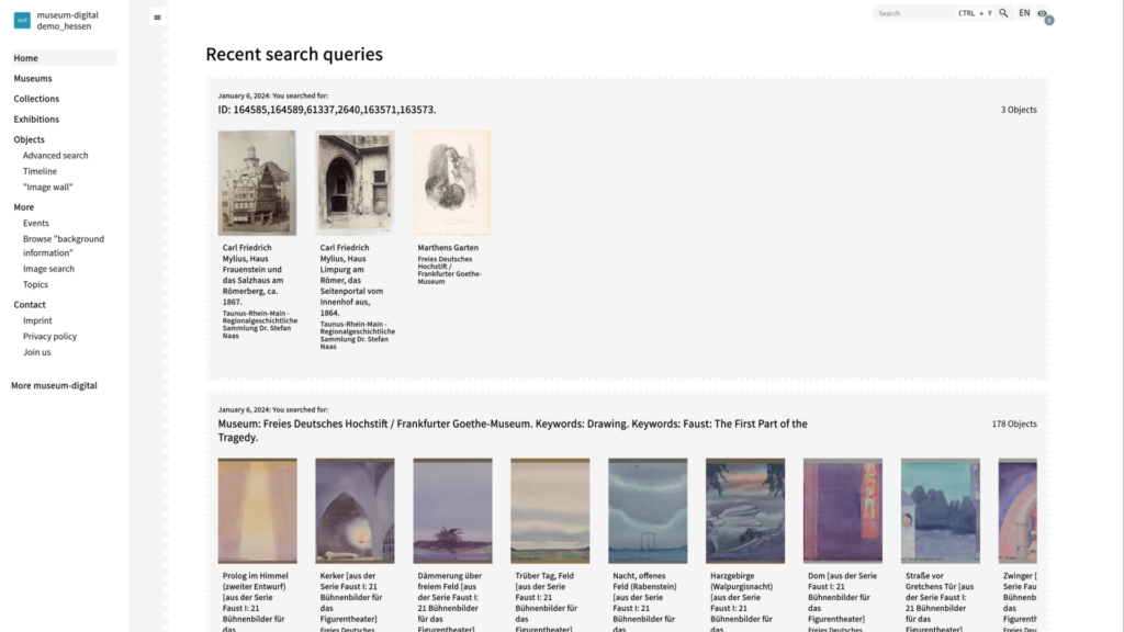
As stated above, the frontend has had quite a number of hard to find features – especially interactive ones like a the option to compare different objects or a watch list (the latter even being hidden behind an option in the now obsolete settings page) and export options. Often, they were hidden by being styled as normal entries in a list. This list in turn could either be found at the very bottom of the page (objects) or in a sidebar. This stems from the idea that users of the site primarily want to see and read things and should not be burdened with anything else unless they are explicitly looking for it.
The most radical change of the new design is our leaving that assumption behind. The new design is instead based on the assumption that people want to see and read things – and then do something about them. Be it to save them, to compare and further investigate them, or to share them.
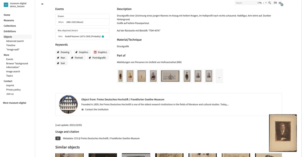
Buttons (styled as such) offering options like the export of a data sheet, subscribing to a feed, comparison, and the watch list are hence now available immediately below the headline of any page offering such options. Whenever the screen size permits, these buttons also feature text explaining their functionality instead of being made up entirely of icons.
Do What Feels Natural
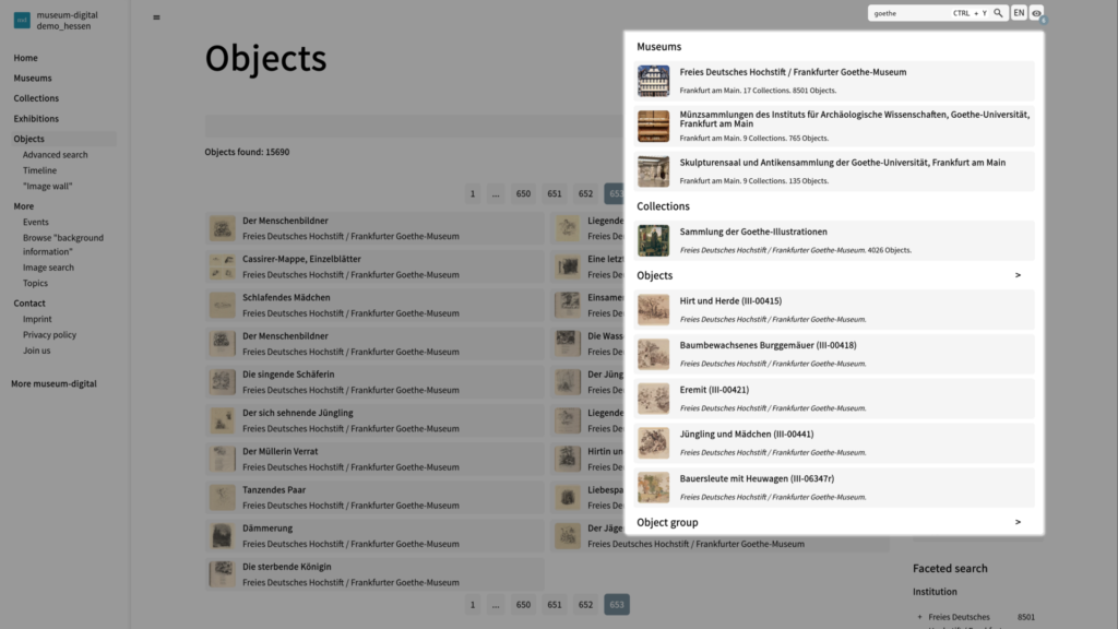
The old design featured some idiosyncrasies. To take the most blatant example: Right next to the page title there was a search bar. The position of the search bar at the top of every page suggests it being a general search bar for all sections of the page. In reality, it was a search bar only for objects. The new design now features a general search bar in its place.
In a similar vein we tried to identify unintuitively positioned or superfluous links. Some features (e.g. the maps for displaying a museum’s location or the locations of all museums represented in a given instance of museum-digital) were integrated into the pages linking to them (the institution’s page or the institution page respectively. They are now accessible as tabs, allowing users to quickly navigate back after viewing the map.
Don’t Repeat Yourself
The old design featured quite a number repeated content. Where possible we tried to identify such duplicates and offer only one, clearer way to access a certain information or visualization.
Hovering over a tag e.g. made links to the timeline and map visualizing objects linked to that tag accessible to users immediately from a given object’s page. These links were removed in favor of letting users click on the tag, see the objects linked to the tag, and then navigate to the timeline or map from there. On the one hand this more clearly communicates what is actually visualized (the objects linked to the tag rather than the tag itself), and on the other it allowed us to remove a flickering and likely unintuitive interaction.
Shapes and Positions Over Lines
This speaks for itself: While the old design used straight lines as dividers a lot, we tried to communicate the separation of different elements primarily by their positioning, size and shape in the new design.
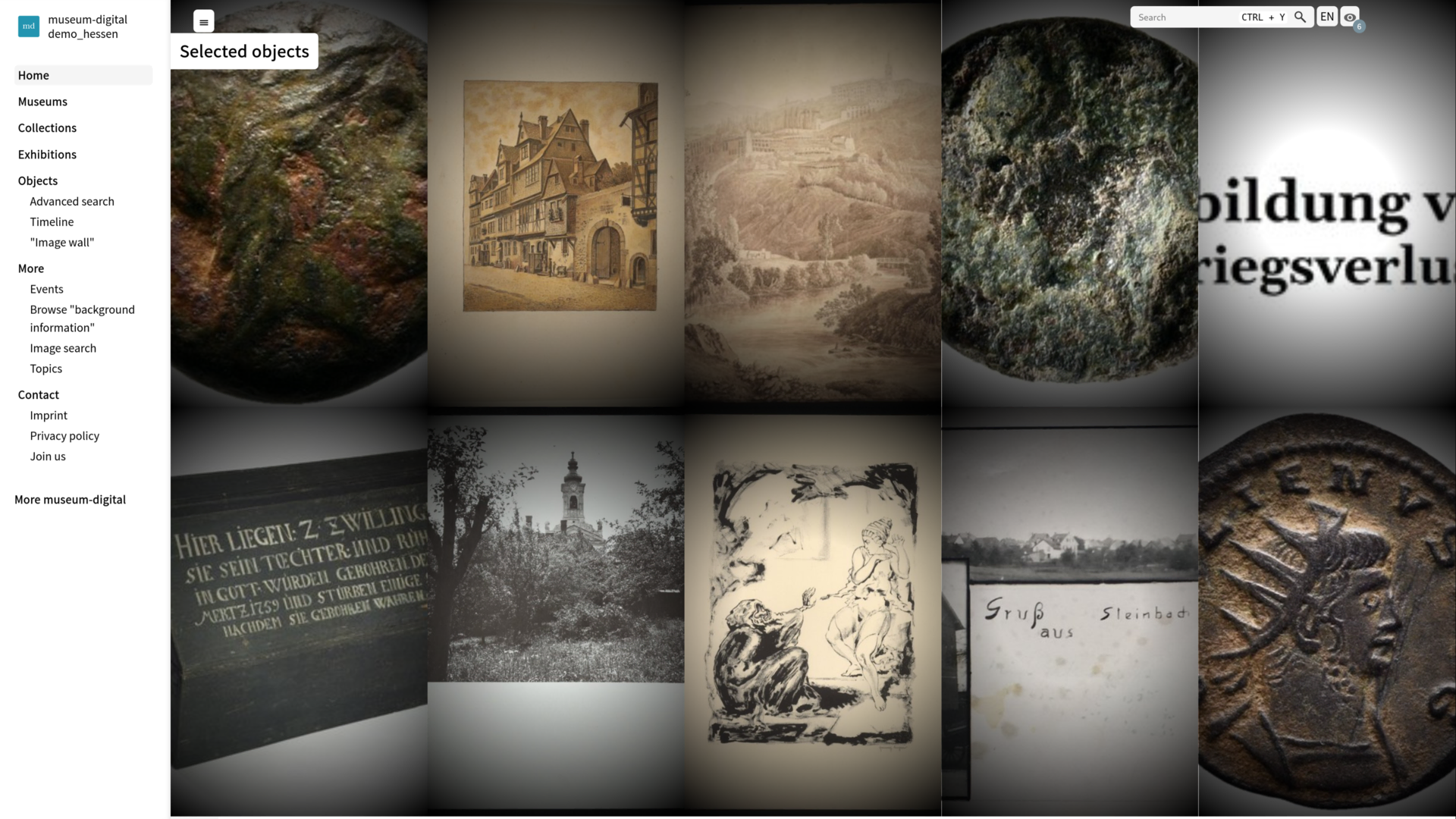
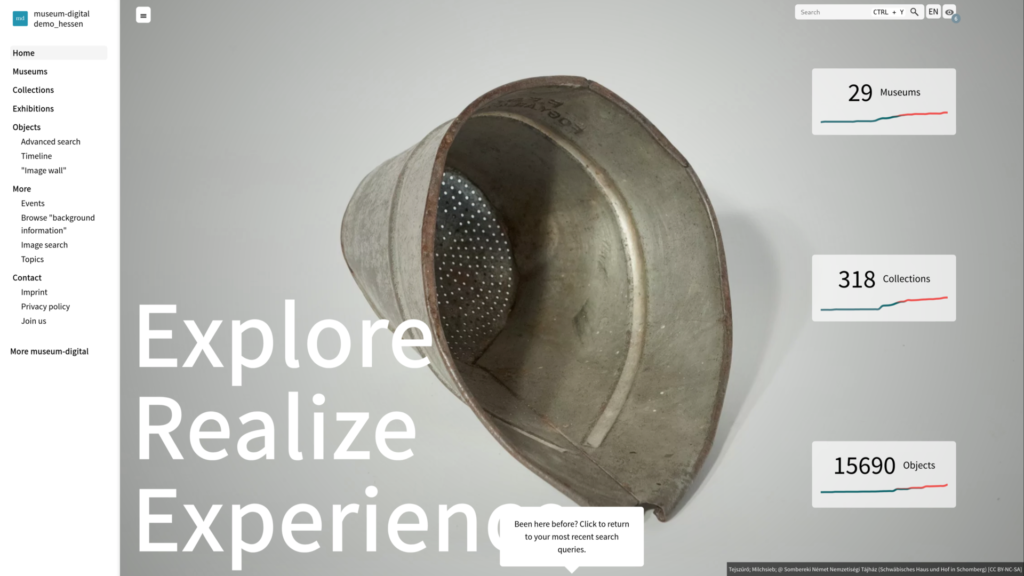
A Tour Through the Re-designed Frontend
Start page
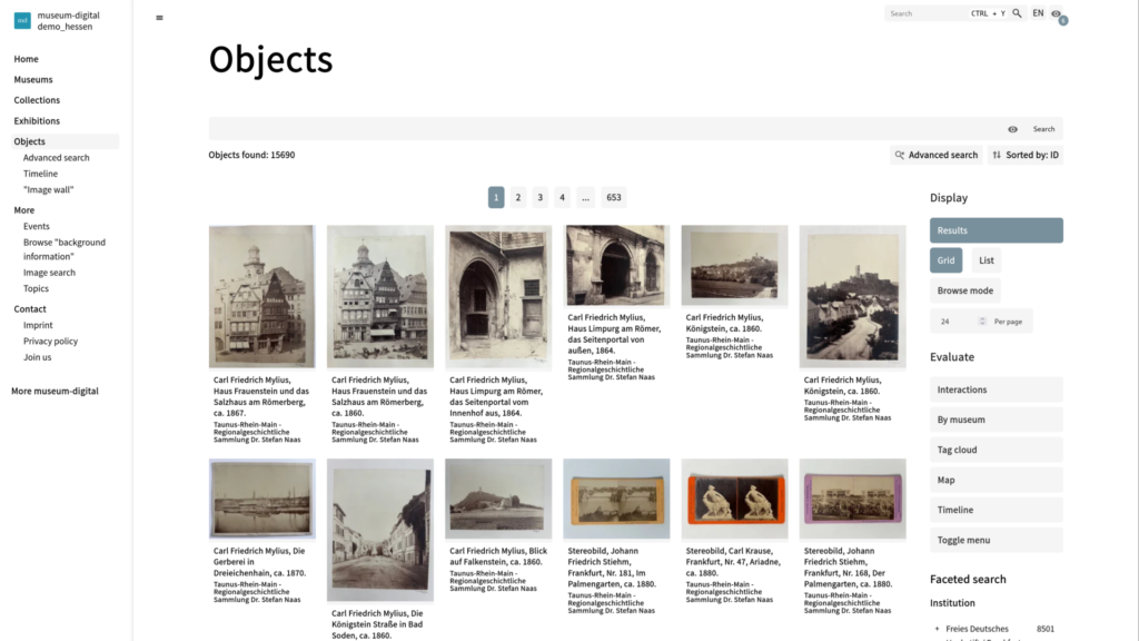
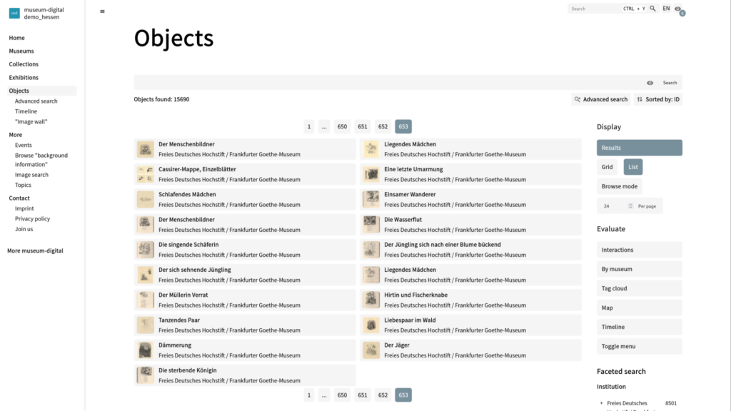
Object Overview: Display options
Extended search
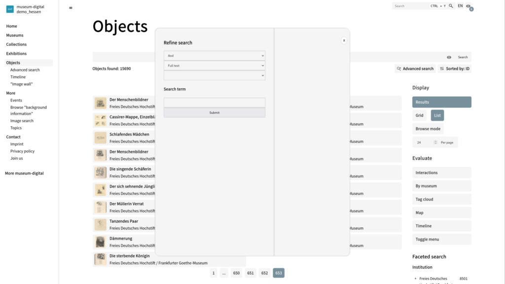
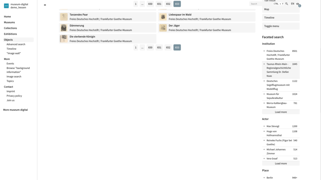
Object overview: Facetted search
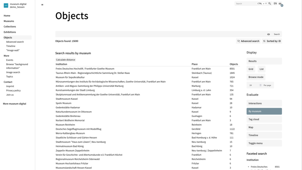
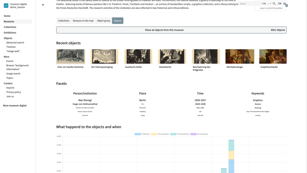
Object Overview: List Results by Museum
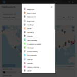
General search
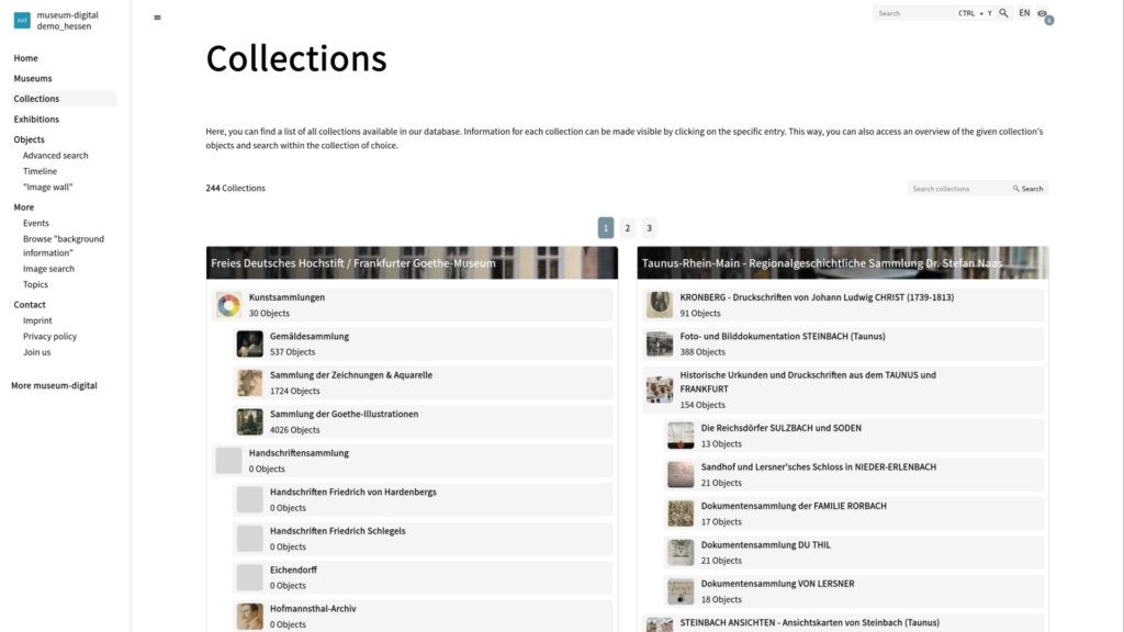
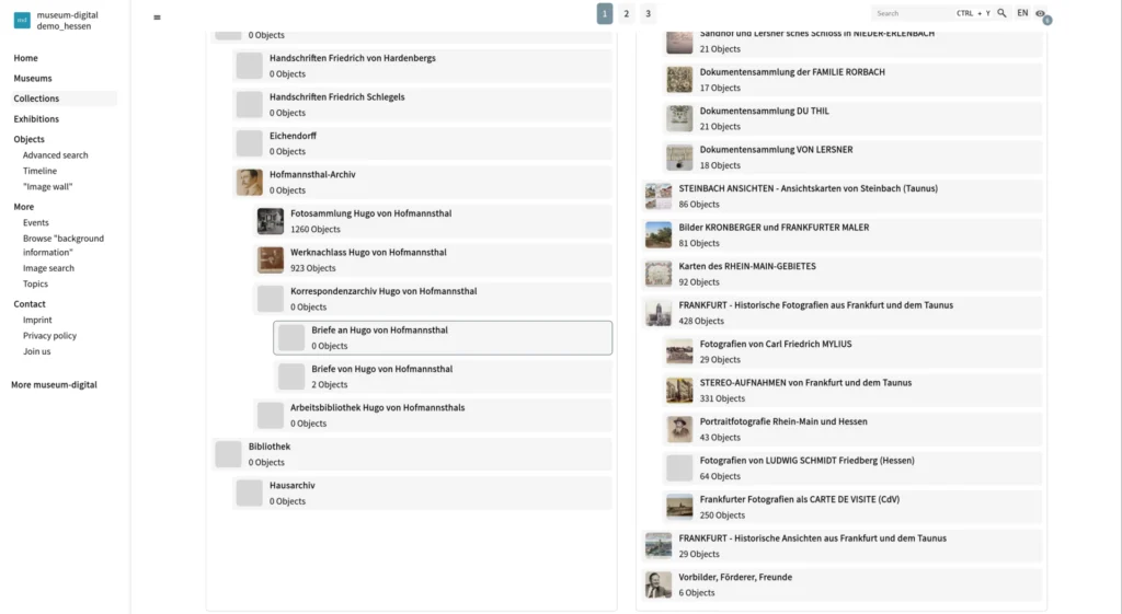
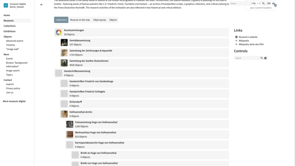
Collection overview
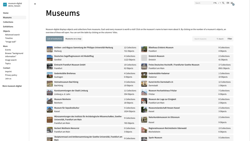
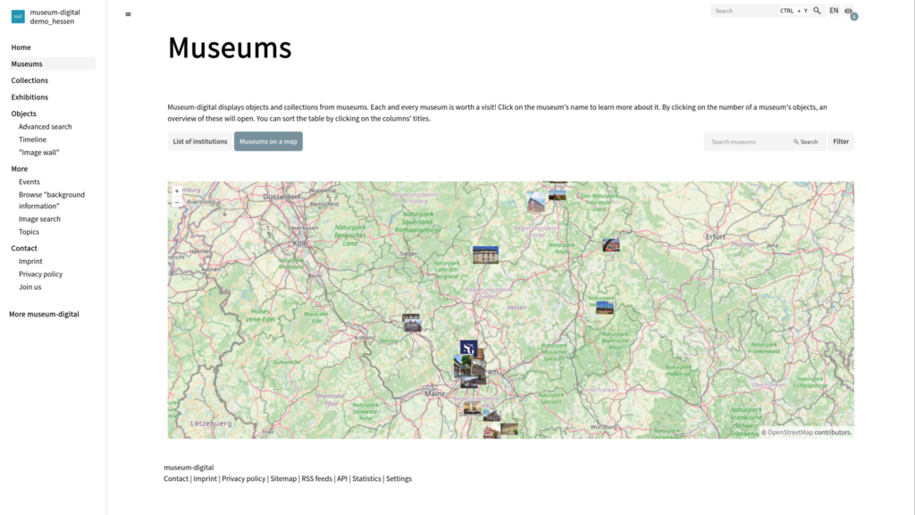
Museum overview
Institution pages
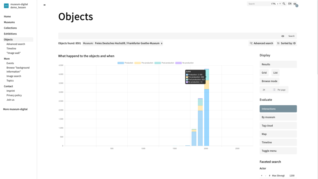
Object Overview: Interactions Visualization
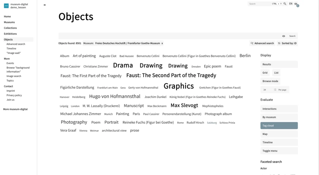
Object Overview: Tag Clouds
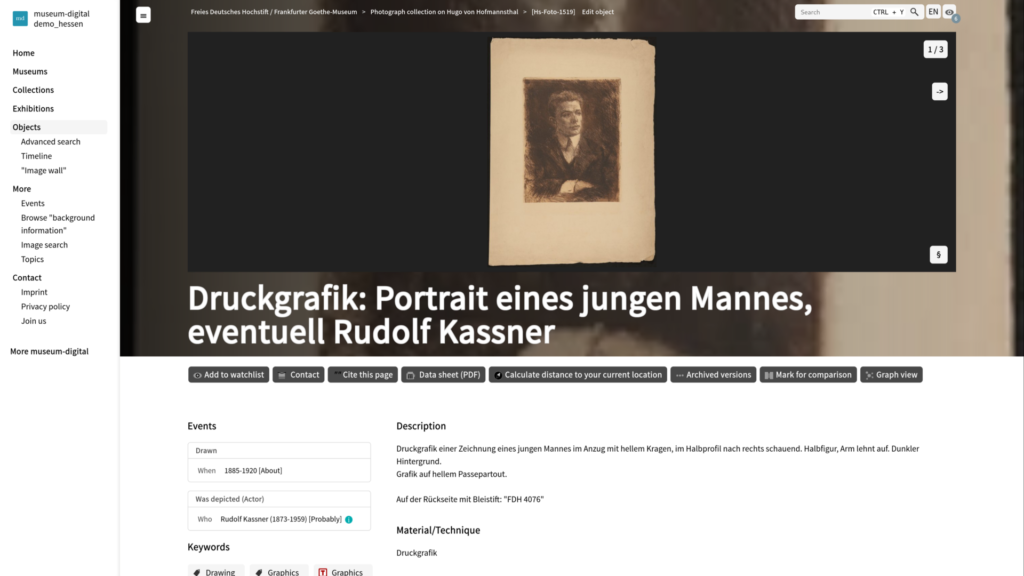
Object Page